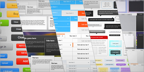
UI elements
Jumpeye framework is a project of Jumpeye Components, developed to help users create responsive and well designed websites for any device.
The framework comes with a huge set of UI elements and styles to serve a stylish responsive website design. The package includes buttons, panels, tabs, tooltips, horizontal and vertical N-level menus, alerts, tables, forms and all of them are highly skinnable using the ready-made customized styles.
Each type of UI element has a set of CSS files. One of them is the common file for that element and each of the remaining CSS files correspond to one skin style. The CSS files also have a minimized version for better loading results.
The CSS files can be easily customized, if you want to modify any of the UI elements. Some of the UI elements styles are using assets files, so if you change the location of the CSS files you have to update the url of the assets files as well (in case the selected style uses external files).
Some of the elements (menus, tooltips and forms) are based on JavaScript. To use these elements, the JS files with the elements' names must be included in the HTML file.
When the UI elements are used with the grid, their size will change automatically together with the size of the browser window. When the grid switches to mobile view, the width of the UI elements becomes 100% and some of them will have a special layout for mobile devices (ex. drop down menus).
Take a tour and view all the included UI elements to get an idea of how useful Jumpeye framework can be for your projects. Enjoy it!